New Look!
Yay!! My blog has a new look. Finally I am able to make a 3-column blog. It looks great on Mozilla Firefox.
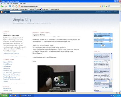
But on Internet Explorer...you can see it for yourself.
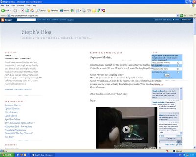
I have tried changing the value for "margin-left" for the main column from a "px" to a "%", yet to no avail. The issue of CSS differences between this two browsers are simply annoying. I have studied books on CSS before coming up with this new look. Didn't expect it to fail on IE though. At least it was not as horrible as boxes being all over the place. For those with IE, I am trying to find a solution to it. For those with FF, enjoy my blog's new look :D
If you have any solutions or suggestions on how to improve the look on IE, please email me.
Thanks.
(Update on 10th April 2006, 19:08)
Many thanks to dawn marie for helping me out by introducing LissaExplains.com to me. From there, I was able to finally get the 3 column outlook that I wanted.
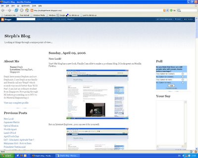
Here's how it looks on Firefox. Here, everything is okay except that the tagboard is not working as it should and the font properties of the headers and title aren't displaying correctly.
Here's how it looks on Internet Explorer. For IE, I have nothing to complain about except the fact that there are two white margins on each sides.
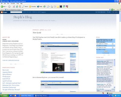
Despite my blog still not showing the way I want it to, I am still content as at least the 3 columns are well-defined.
Once again, thanks to dawn marie for her helpful solution :D
If anyone has any idea on how to solve the problems showing in the two browsers, please tell me, I would be very grateful if you did :)

But on Internet Explorer...you can see it for yourself.

I have tried changing the value for "margin-left" for the main column from a "px" to a "%", yet to no avail. The issue of CSS differences between this two browsers are simply annoying. I have studied books on CSS before coming up with this new look. Didn't expect it to fail on IE though. At least it was not as horrible as boxes being all over the place. For those with IE, I am trying to find a solution to it. For those with FF, enjoy my blog's new look :D
If you have any solutions or suggestions on how to improve the look on IE, please email me.
Thanks.
(Update on 10th April 2006, 19:08)
Many thanks to dawn marie for helping me out by introducing LissaExplains.com to me. From there, I was able to finally get the 3 column outlook that I wanted.
Here's how it looks on Firefox. Here, everything is okay except that the tagboard is not working as it should and the font properties of the headers and title aren't displaying correctly.

Here's how it looks on Internet Explorer. For IE, I have nothing to complain about except the fact that there are two white margins on each sides.

Despite my blog still not showing the way I want it to, I am still content as at least the 3 columns are well-defined.
Once again, thanks to dawn marie for her helpful solution :D
If anyone has any idea on how to solve the problems showing in the two browsers, please tell me, I would be very grateful if you did :)
Tags:



4 Comments:
For help with a 3 column layout or any css or html question, I recommend visiting LissaExplains.com. Her tutorials are simple to follow and manipulate. It looks good in firefox, alright!
Hey! Thanks a lot for that helpful website. I really appreciate it.
Ahh, the fight between good and evil, IE and FF. If that's the worst problem you have, consider yourself lucky, there are a whole other slew of problems you could stand to run into depending on how well the theme was coded.
However, I use FireFox, so everything looks great to me. :) Keep up the good work.
Yah, I have heard and read of the serious problems that others have encountered i.e. messed-up alignment, pictures at the wrong places and content hidden by white "boxes". I sure am glad that all these didn't happen here.
Thanks for the compliment :D
Post a Comment
<< Home